
An in-town renovation
By Seth Mensing ∙ Photos by James Ray Spahn
For the owners of 106 Sopris, all it took was one summer visit to Crested Butte and they were hooked all over again. They’d come to ski with friends 30 years before and then they came to ski again. When they had a daughter and then a son, they brought them to ski and dreamed of buying half of a duplex. But the price was $80,000 and just out of reach.
Year after year they came and went, falling deeper in love with Crested Butte and its Mayberry feel. Finally they came without the skis and saw why an old maxim had become a cliché: You really do come for the winters and stay for the summers.
With the children grown, the couple decided it was time to find a place with some gravitational pull, where their son and daughter would be drawn to visit when time allowed. They thought they found it in a house on a quiet corner of town just off Elk Ave., but when they made an offer it was rejected. The house was, they admit, quite ugly, so they didn’t mind waiting a year before making a second offer, which the owner accepted.
After it was theirs, they waited again, this time living in the house several weeks a year for a year and half before they started the renovation. “They knew where the light came in throughout the day, they knew how they would live in it and where things should be,” interior designer Kristine Pivarnik of KPD Studios says. In September 2016, they enlisted the help of Pivarnik, architect Andrew Hadley and Johnny Biggers of Crested Butte Builders to start the process of turning the house into the vacation home they wanted.
“For someone who wants to hire a designer and get the most out of their money, they need to bring them in at the beginning of the project,” Pivarnik says, “because all of these considerations can be to make their house functional and special and to really get the proper use out of it.”
Compared to the other houses on Sopris, theirs was set back from the street, squeezing the backyard and stretching the front. “That was the one thing they were a little concerned about. They really love having a backyard area,” Pivarnik says. “So they made [the front yard] a really nice recreational living area and have embraced it as the backyard, even though it’s the front yard.”
Inside, a living room with a vaulted ceiling that opened to a loft wasted what was valuable space in a family home. The paint and finishes were dated and the floorplan allowed for just three bedrooms and two bathrooms.
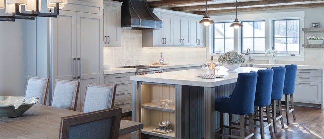
By reorienting the front of the house, the team brought the front door closer to the interior stairs and divided the living room into a first and second floor to make room for a fourth bedroom upstairs. Downstairs the plan still provides plenty of space for a kitchen island big enough for pizza boxes and a 1,000-piece puzzle, a dining area and a large living room, where whitewashed planks and reclaimed beams give the ceiling a texture Pivarnik uses strategically throughout the house.
“We definitely use elements and principles of design, rhythm, shape, texture, scale, proportion. The owner initially wanted this handrail from Jeff Brethauer [of Blackstar Ironworks] and we were like ‘Yeah, Jeff makes great handrails,’” Pivarnik says, “but we needed to create a rhythm in the house so [the handrail is] not the only item.”
Knowing her clients love the Crested Butte summers as they do, Pivarnik and her assistant, Katie Heubert, used light shades of paint on the walls and ceiling and light finishes and upholstery to keep the interior feeling bright and open, while the naturally hued wood and hand-forged iron provide warmth. “They wanted it to feel inside in the winter like they feel here in the summer,” Heubert says. “They wanted it to be bright and open.”
Rounding out the downstairs is a bedroom, bathroom, powder room and pantry, each with some element that adds depth to the space, as in the quartzite countertops, the iron hood above the stove, or the beautifully hand-carved wooden panels in the front door.
“That’s one of the things we feel is really awesome about this place,” Heubert says. “It has a good mix, a good balance of textures.”
An open stairway leads past an impressive reclaimed wooden beam that weighs around two tons and provides a focal point and structural support to the front of the house, to a hallway that connects the three bedrooms and bathrooms on the second floor.
The remodeled house has a bedroom and accompanying bathroom for everyone, including a fun bunk room for the grandkids, complete with bunk-beds, kid-friendly fixtures and a walk-in shower finished with fossil-studded tiles.
And the home’s placement on the lot, which was originally seen as a bit of a drawback, opens the view from the second floor since it provides some separation from the neighbors, offering an unobstructed view of Red Lady.
For the owners, the light and color palette lend a beach house feel to the house, as well as a mountain retreat. The open plan and reorganized sleeping quarters perfectly accommodate a growing extended family. But it’s the attention to detail and the elements that you won’t find in any other home in town that really set the project apart.
Describing a scene in which one of Crested Butte Builders’ craftsman spent a few moments agonizing over one small detail until it was made perfect, Pivarnik says, “This is what our homeowners don’t see. These guys care and are so attentive. They’re not just slapping up paint. They feel proud of what they produce and doing it any other way is not an option. They’re almost like artists.” •


